This is the third article in what I’m now calling the “Masters” series. First we had Lighting a la Rembrandt, then Color Theory with Matisse, and now I want to explore Composition through the work of Gaudi. I hope you enjoy and would love to hear from you folks about future articles you’d like to see! Enjoy…
Antoni Plàcid Guillem Gaudí i Cornet, born June 25th, 1852 is regarded as one of the most forward thinking architects ever to have conceptualized structure. Anyone who’s been able to physically interact with any of his creations can attest to the dreamlike surreality and challenged perception that they conjure. His vision and creation transformed the landscape of his native Catalonia into one of the most architecturally unique areas in the world. And this was a hundred years ago. His edifices to this day, help define Gothic architecture while having created an entirely unique genre all to iteslf. Reading through the most recent National Geographic (Dec. 2010) found me face to face with the history of the basillica Sagrada Familia, arguably Gaudi’s most famous project, which at the time of his death in 1926 was just getting started (and isn’t projected to finish until 2026!). He approached his designs from a natural place allowing the concepts of fractal mathematics to translate into a man made homage to the natural beauty existing all around us. Of his exploits, and largely shown in his designs for the Sagrada Familia, he said;
“If nature is the work of God, and if architectural forms are derived from nature, then the best way to honor God is to design buildings based on his work.“
Regardless of your views on nature, God, religion, architecture or photography, it’s hard to disagree with the idea that his architecture is unique and comes from a place of naturally inspired creativity. I’d like to look at natural, fractal based concepts in an artistic application and the way that they can be brought into photographic composition. Many of the “rules” of artistic and photographic composition pull from these very natural occurrences.
Let’s quickly look at fractals. You may remember them from the cover of your high school advanced geometry text book or attempting to calculate and graph series of repeating, exponential values. From wikipedia, A fractal is “a rough or fragmented geometric shape that can be split into parts, each of which is (at least approximately) a reduced-size copy of the whole.”
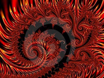
Here is a digitally generated conceptual fractal illustration.
Seen in anything from a snowflake, to sunflowers, to a nautilus, fractals are naturally occurring in many organic things. Here we have a nice, naturally occurring example from my friend Andree in the way of Romanesco Broccoli:
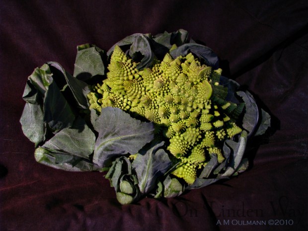
©2010 A M OULMANN http://www.onlindenway.com
Fractals and the sequence that helps define them mathematically is also referenced in what is known as the golden ratio (see golden mean, golden section, golden proportion…) , of 1 : 1.618. By applying this ratio into an area, lets say a rectangular photograph, canvas, or television screen, it provides a spiraled path which is visually pleasing when points of interest reside on this path, or are positioned spatially at this ratio throughout the frame, as it allows our eye to view these points of interest in terms of this organic, naturally occurring ratio.
You can orientate this sequential breakdown any which way you want, but by placing subjects along the spiral compositionally, you can engage your viewer’s eye by maintaining a spacial relationship between elements in your photograph which follow this organically pleasing ratio. Our eyes naturally tend to travel to points of contrast, be that strong luminance contrast, or as we’d talked about earlier, points of color contrast in the Matisse article. Most people will tend to start into an image similarly to the way we read. Myself, being a westerner, I read from top to bottom, left to right so I find that I gravitate to images that grab my attention initially somewhere in the top left and continue me through the image as if I were reading almost. Not something that I would say is conscious, but when looking at most of my “favorite” images, they tend to be composed as such. (Maybe it’s just me, but it got me thinking and researching and here we are.)
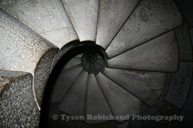
Here is a shot I’d taken at the bottom of one of Gaudi’s nautilus-like stairways in the Sagrada Familia a few years back. This is one very obvious example of his use of form to mimic nature in his architecture.
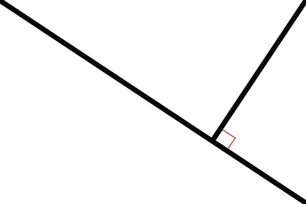
The concept of dynamic symmetry, a proportioning system using the same ratio (1 : 1.618) developed by Jay Hambridge, is directly related to this idea of the golden ratio by using divisive lines to produce intersection points at right angles from triangular delineations within a space. Of course I’m dumbing it down and would suggest anyone interested in a more in depth mathematical explanation on this or any of the aforementioned concepts, spend a little time with our friend google.
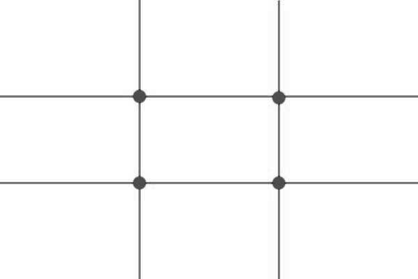
A more simplified version of this is the very common rule of thirds. While not a direct conversion of the golden ratio, it urges an artistic protagonist to place points of interest on the dividing lines or intersecting points when dividing an image in thirds both vertically and horizontally. Whether that is a horizon line, or using one of these intersecting points for an off center subject, traditionally speaking, it is more visually pleasing for the points of interest in an image to be positioned as such and when you look at the points of intersection in both the golden spiral as well as that of dynamic symmetry, it isn’t a coincidence that they are close to the points where third lines would otherwise intersect.
Here are the three diagrams overlaid on each other…
Now that we have our compositional ratio more or less figured out by where we want to put our subject in frame, it is equally as important to story tell within a picture. You can have an image with strong contrast, bright colors positioned along the golden spiral and intersection points on your third lines, but if the subject isn’t interacting with your frame, or lacks any story, it may just be a well composed picture that is boring. There are no universal right or wrong answers as far as I’m concerned when it comes to what constitutes a good subject or image, only right or wrong answers for any particular viewer. If you’re trying to gain praise from an audience, keep your audience in mind when shooting. If you’re only looking to compose and capture images that you enjoy, shoot how and what you love. Here are some basic compositional elements and concepts to keep in mind when composing an image.
Leading lines can help direct your viewer’s eye through your image. Any definable line within the image can be a “leading line” including those that may lead your viewer’s eye out of the image which may also be referred to as a terminating line. Areas of strong contrast (the edge of a dark figure on a light background), a horizon, a path or street, etc can all be used to direct the viewer. By consciously using these leading lines, you can more effectively define your image, its story and dictate where you want the attention in your image to be paid. When a leading line is used in conjunction with the golden rule, or rule of thirds you can provide a potentially more compelling and pleasing image as it plays to our tendency to be visually drawn to images which are composed as such (keeping the horizon off center, etc).
I think of positive and negative space within an image as “active” and “inactive” space. Using space and shape within an image is one of the fundamental lessons when formally taught any visual art. Neither positive nor negative space in any image needs to be dominant necessarily, but to me, if one is dominant, the opposite needs to be justifiably suited and balanced. If you have an image with a small subject which you wish to draw attention to (active/positive) against a large area of color as a background (inactive/negative) for instance, the subject should be able to carry the image as a whole whether that is a strong pose, contrast, or immediate visual interest.
Visual balance can come into play when you have strong points of interest or subjects which demand attention. If you are composing an image of the sun setting over the ocean with the shore in the foreground, you may need something (a rock, a person, a piece of driftwood, etc) which can anchor the foreground and balance the visual interest by pulling your viewer’s eye through the entire image as opposed to being locked on the bright colors in the sky for instance. Personally I like to try and provide 3 points of interest, creating a triangular path to meander through the image. This, in my opinion, provides enough to draw you through the image without being over stimulated by having your eye jump all over the place.
An easy way to play to the concepts of positive/negative space, and visual balance is by way of contrast. Our eyes will naturally find these areas of contrast in an image. Whether they are luminance, or color contrast, our brains process the information while our eyes are searching for defining points to help us understand what we’re looking at. Normally, our eyes tend to lock on to the sharpest and brightest elements in an image. They are, at first glance, the easiest to see and in turn, the easiest points from which we are able to determine what we’re looking at.
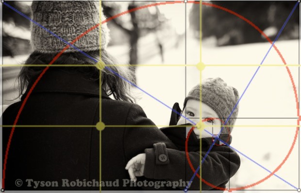
With the following image, I tried to anticipate this while consciously composing through the viewfinder as I walked behind.
The dark coats and hats would be an easy leading line through the negative space, which in this case was snow. I wanted to draw the viewers eye through the image ultimately landing on my little guy’s face. Theorizing that I’d be starting at the top left, I used the back of Mrs. Squeeze’s head as the first anchor, next the dark area in the top right corner and finally down to LBWHF’s face.
While my image above is perhaps not the very best example, I chose it because it has a few compositional elements, and a use of contrast that helped direct my eye through the image, starting at Mrs. Squeeze’s head, down to Little Baby What’s His Face. The contrast between the dark and light areas in the image are divided on the diagonal provided by the blue line from our Dynamic Symmetry overlay, our eye can travel from dark to light taking in the story of the image (behind some lady’s head, on a walk down the road, in the snow, must be cold, hey there little guy!) as we follow the golden spiral which leads us directly to a convergence of that spiral, the right angle in the dynamic symmetry and a point on the rule of thirds at LBWHF’s face which is what ultimately I want to be focused on in this particular image. This “journey” can take a fraction of a second. Our minds process these elements almost instantaneously but then, as it soaks in, we tend to digest each detailed element and its relationship to the whole image. I want people viewing this photo to say “I went right to the baby’s face” as this is exactly where I want the attention in this particular image to be. It’s a picture of the little guy looking back at me, so that is what I want it to convey regardless of who is viewing it. The leading lines draw our eyes through the image into the background as if we are walking along with them giving us the perspective that the path they’re on continues. There are some darker elements in the out of focus background that I’d rather have been able to not have in there, but I’m happy enough with the composition in that those elements are secondary, existing in the negative space, as they are so obviously out of focus. The dark blob in the top right is lending a balance to the dark corner opposite it, and it helps frame LBWHF out of the negative space in the out of focus area in the image. If it were not there, I fear that the negative space would have been too prominent allowing my eye to wander out of the frame.
Having walked through some of these “rules” of composition, I also want to point out that I am a firm believer that rules can, and should be broken. Some of my favorite photographic images go against this tried and true compositional framework. While using these “rules” can help build a more interesting image, I think that a photographer can really benefit from knowing which rules they’re breaking and why.
Okay, so, nature has provided us with a mathematical super ratio which has been used by so many prominent artists throughout history to intricately compose their creations. Next time you see a beautiful building, striking painting, or intriguing photograph, take a closer look at it and see if you notice any of these compositional elements.
Please feel free to subscribe to the blog, you can do so by adding your email to the field at the top right of the page ( yeah, up there ^). I will not use, sell or in any way abuse your email address, it will only automatically send you an email when I post a new article.
Thanks to all and keep shooting,
Tyson





A very well written article Tyson – really.
I particularly think the “smorgasbord” overlay is particularly clever, but even more powerful when laid over the photo of Mrs. S and LBWHF (lol!).
It’s pretty amazing how these natural forces are underlaying so many elements.
I’m going to go and read the other articles in this series, and have passed this on.
Bravo!
LikeLike
Thank you Andree. As I was starting to outline this article, your image immediately came to mind as it had stuck out and stayed with me after having seen it a while back. Such interesting stuff, and a perfect example of a natural sample.
Funny how much nature, art and science cross over. Free flowing creativity and meticulous mathematical documentation can coexist!
Thanks again,
t
LikeLike
thanks for sharing…
i cant wait to read more of your “Master” series 🙂
yes… this is Art!
LikeLike
Thanks and I’m glad you’ve enjoyed it!
LikeLike
Interesting to think about all of the elements you mention, Tyson – what we let other people see of our photos after cropping/postprocessing them vs. what we shoot on-the-fly.
We take dozens or hundreds of technically correct, in focus photos, composed more or less pleasing fashion. These shots are then post processed into a final photo which is eyeballed for excitement or at least interest (the story) and the winners of that artistic process go on to be showcased as prints or blogs, etc.
I tend to think of a center of interest as LBWHF’s face. This focus is usually off center a bit (maybe in thirds) and not to close to the edge so cropping can still take place, a direction suggested (like the lines you mention), and not too much (or no) distractions outside that center when shooting a shot.
Also worth mentioning are Photoshop and PSE’s ability to recompose a picture for tightening up a shot that’s got elements of interest separated by too much space.
LikeLike
As always Terry, thank you for your insightful comments. Depending on the day, my mind may be approaching photography completely differently than the day before. I would guess others tend to approach shooting similarly, and I have been enjoying continually evolving and learning. So much in composition is logical, but until I actually think about it, it is easy for it to go absent when looking through the viewfinder.
The ease of working with digital files, cropping, straightening, et is another wonderful benefit to the modern workflow. While it is important to try to get as much right in camera, it certainly helps being able to fine tune an image so easily after the fact. Not that it wasn’t (or isn’t still) happening in the darkroom, it is just so quick and efficient now a days.
I personally take quite a few frames where I compose to have my subject dead center, or near the edges. Sometimes pure symmetry, or overly pronounced asymmetry can be pleasing (speaking for myself at least). There are no universals as far as I’m concerned. What is wrong, ugly or incorrect to one is inevitably the opposite to another. Some of the more praised “artistic” shots I’ve seen, to me are boring, uninspiring and while perhaps technically adept, I find little to hold my interest and wonder why they receive the accolades that some do. At the same time, I see images by people I feel should certainly be getting more attention that do not. It may be the fact that I was never formally taught what makes a “good” photograph, but I like that I have fewer guidelines as it were and can feel free to like or dislike an image almost despite it’s apparent technical qualities.
Thanks again Terry, always a good time.
Tyson
LikeLike
Pingback: *The Eyes Have It. «
Pingback: *Everything you need to know about digital photography. Two years of tips, tricks and various freebies, revisited. «